The Design of Everyday Things
I first picked up The Design of Everyday Things (DOET) on the recommendation of my friend Hareem. After I started reading it, I started noticing it mentioned everywhere as one of the seminal books on design.
As we go about our daily lives, we will typically encounter hundreds of different products: from doorhandles to traffic lights to email clients. Navigating these different devices is difficult, and often frustrating (how many times have you desperately tried to open a door or cabinet?).
Historically, the builders of these products have blamed the user: “clearly they didn’t read the instruction manual” or “they pressed the wrong button because they were tired.”
DOET takes a different perspective: it is the duty of builders and product designers to make these products easy to use. Full stop.
The book shares a number of frameworks for building better products, thinking more like a user, and a bunch of delightful examples of how products succeed or fail to be well-designed in the real world. It’s definitely changed the way that I look at various products, from the apps on my phone to my coffeemaker.
A language of design concepts
Just in the same way that we might describe engineering concepts with various pieces of vocabulary, Don Norman tries to craft a language for various design and accessibility concepts.
Affordances - an affordance describes an interaction between a thing and an agent (e.g. a person). If the thing serves the purpose for that agent, it has an affordance. E.g. a chair affords support and a place to sit for most people. Some chairs afford lifting by a single person. Others do not, and do not have this affordance for each user.
Signifiers - a signifier is a signal which communicates what sort of affordances a physical object might have. With doors, these communicate which way a door should be pushed or pulled. If you have to resort to text, the design is likely bad.
Mapping - mapping involves taking a conceptual model and mapping it to a real physical model. In the same way that a seat adjuster might have two buttons (one for the back of the seat, one for the bottom), or a set of light switches might map to the physical layout of a space.
Feedback - good design involves good feedback. When you see people pushing a button repeatedly, and not being sure about what it means, chances are good that it's been poorly designed.
Conceptual models - often, a designer will present a conceptual model of the way something works to the user. It might or might not actually be the way the thing works, but a good interface will communicate the right things to the user. A bad example is a fridge which has two separate knobs for the freezer and fridge. If these two knobs are connected, the user's conceptual model won't match!
The system image - there's a relationship in most things where they go from designer -> physical product -> user. Critically each of these impressions has to happen out of band and in the product!
Knowledge in the head vs knowledge in the world
There are certain things that we must remember the facts for and commit to human memory. We can call the things that that we just “know”, knowledge in the head.
At the other end of the spectrum, there are pieces of knowledge which we don't have to think about because they are intuitive and present (e.g. what the face on a penny looks like). This kind of knowledge we can call knowledge in the world.
I’d originally assumed that having more knowledge in the world is “better”. We should strive to create products which a new user can fully intuit from markers in the product itself.
But a big point of the book is that neither type of knowledge is inherently better. Instead, there’s just trade-offs between the two!
More knowledge in the head requires that the user memorize more different pieces of information. There’s a steeper learning curve compared to knowledge in the world. But if a user only relies on knowledge in the world, they’ll have more mental load.
Typing is a perfect example of this phenomenon. “Touch typing” is in the head, while “hunt and peck” typing is in the world.
There’s a bunch of different techniques and aids we can use to make both sorts of knowledge easier.
For knowledge in the head, we can provide various visual cues and mnemonics to make it easier to remember a certain piece of knowledge. Long-form poetry was originally used for this purpose. Because it followed a rhyme scheme and meter, it made it easier for bards to remember long passages from epics like the Odyssey.
An approximation for short-term-memory: each user has five slots of things they can remember. Don’t expect more than that!
For knowledge in the world, we can provide different visual cues to nudge the user which way to go. An often-cited example in the book is the burners on a stove. Stoves with more intuitive designs
The key thing to remember: distinguishing features are only important when choosing between options! Don’t bother overloading the user with explanations when the options are the same.
Knowing what to do
There’s a bunch of examples in this chapter about how to understand “what to do” as a user. My favorite is around batteries. It turns out that the little spring on the negative terminal of the battery doesn’t actually do anything, it’s just there as a cue for the user. It’s easier to place the flat end against the spring than the positive end.
These sorts of norms, whether enforced physically, or as a cultural norm help influence how a user should use a product. In that way, design must be very specific to a particular context.
Constraints can be cultural (do you greet someone with a bow or with a kiss?), physical (what piece fits where), or logical (I have one piece left over, it must go here)
You can design flows as either activity-based or device-based. Activity based would be "I am using this auditorium to give a lecture, vs show a movie". Device based would be: "I have these six rows of lights".
Interlocks: some devices require you to have a "dead man's switch", e.g. a chainsaw or a microwave, which keeps you from doing anything dangerous.
Lock-ins: are tools which keep you "locked in" from doing the wrong thing. E.g. Word will do its best to ask you to save a file before you quit.
Human error, no, design error
Most kinds of errors are actually design errors-that's the reason that "5 why’s” analysis is so powerful, it seeks to actually examine what caused the human error.
Social pressure is often a huge issue. People are reluctant to report a superior in terms of making issues, or admit fault themselves.
Besides that, there are two kinds of human errors slips and mistakes. Slips happen when the person intends to do one thing, but ends up doing another. Mistakes happen when the wrong goal is set for something, and a bad plan is formed
These form the different areas of the learning feedback loop:
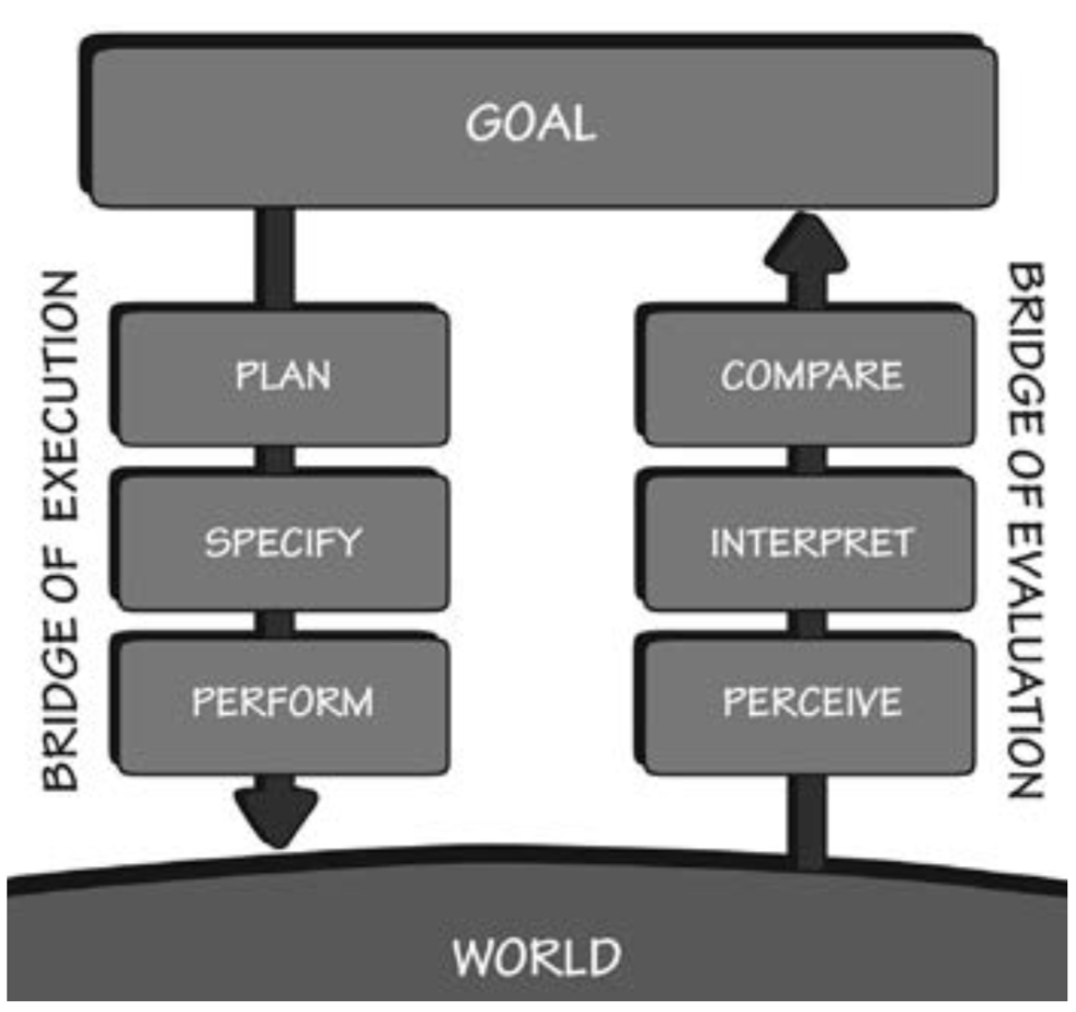
Mistakes happen on the left side of our diagram, causing people to do the wrong thing at a conceptual level or just in practice. Slips are a miss in terms of feedback or precision as it comes back.
Design thinking
This chapter focuses on design thinking. I’d always heard of it before, but never had a crisp definition. Design thinking first identifies the right problem, through divergence and convergence, then the right solution.
In many ways, design thinking mirrors what I’ve experienced empirically, that some people are great at identifying problems, and others are great at solving them. Some people who excel in one dimension aren’t always great in the other!
The reason to emphasize design thinking is that the biggest risk in any project is always: “are we solving the right problem?”
Design has to understand what people actually need. Marketing has to understand what people will buy.
The recommendation whenever designing an experience is to focus on “activities” rather than “tasks”. In the same way that people would ask for a “faster horse” instead of a car, focus on the end job to be done: transportation.